MEAN
Miami, USA
2021

Brand Identity
Brand Architecture
Iconography
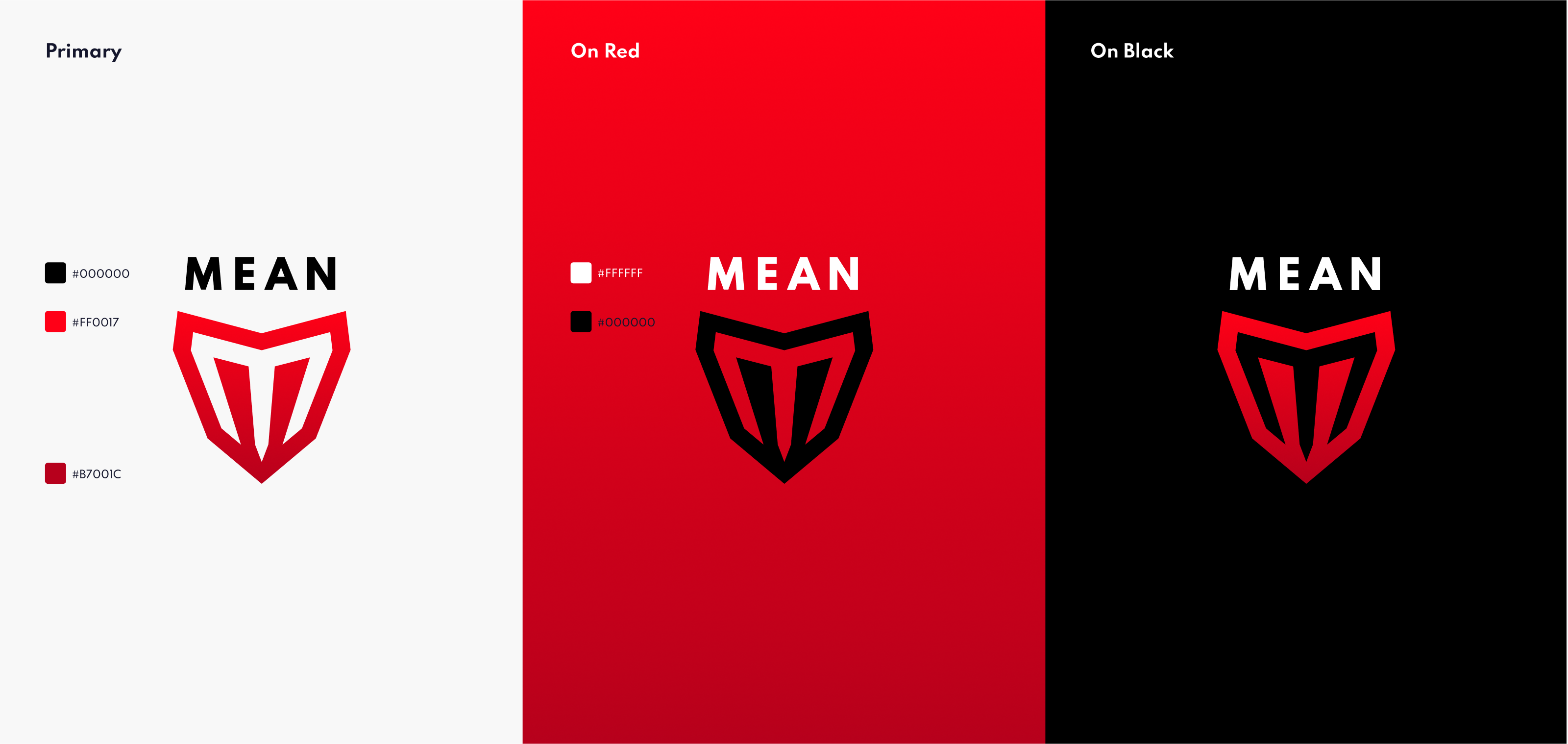
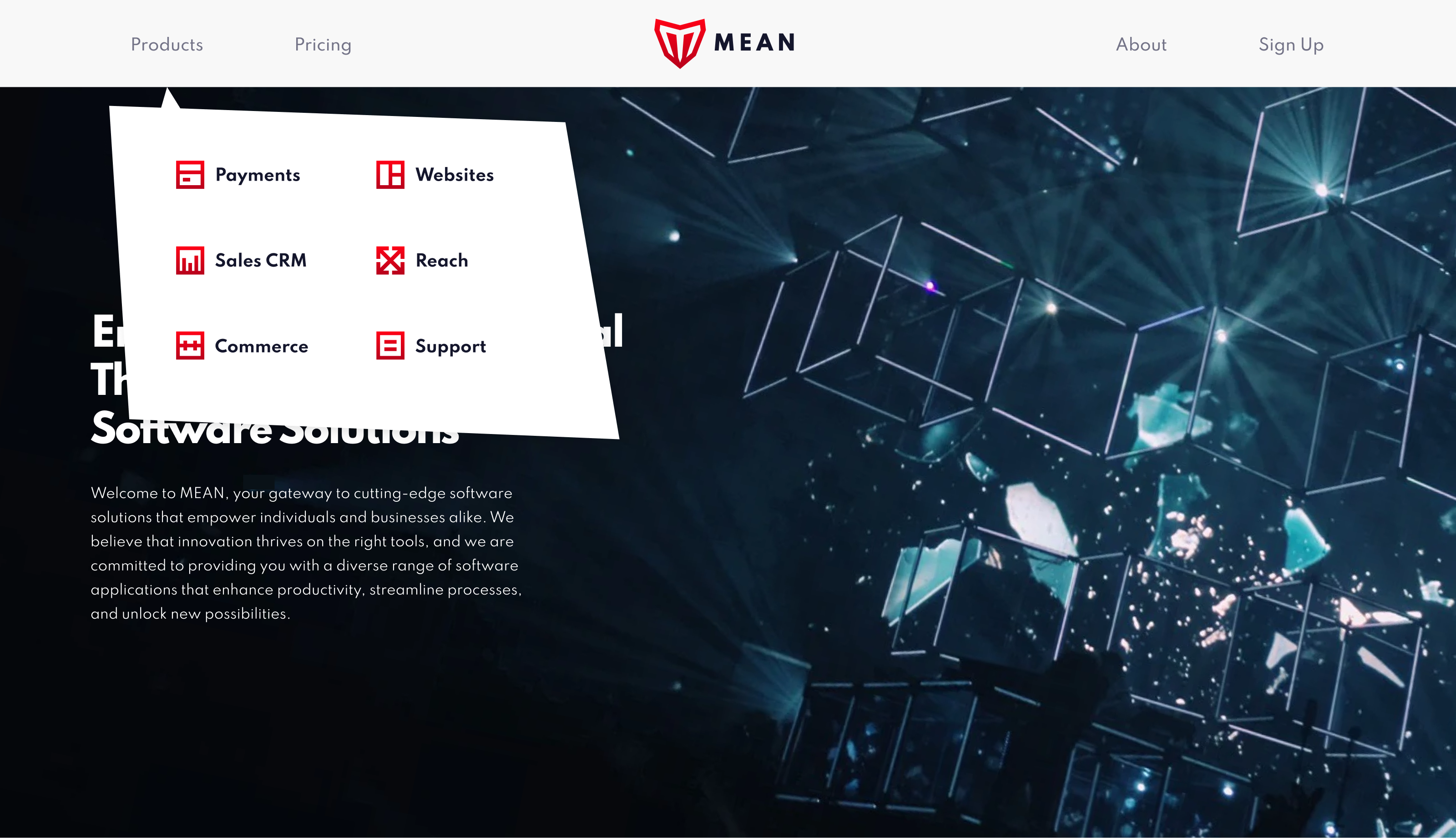
MEAN, a startup creating a dynamic suite of software tools, was seeking an innovative brand identity. MEAN represents Methodical, Efficient, Adaptable, and Nimble – the core values that define both the company and its software offerings. Our design blends timeless aesthetics with a touch of futurism, reflecting the cutting-edge nature of the tools. The colour palette is bold, symbolizing the commitment to empowering users with decisive solutions. In crafting the suite's icons, we embraced a minimalist style, ensuring each icon captures the function and purpose it represents.
Our solution aims to create a visual representation that conveys MEAN's commitment to excellence while fostering a sense of trust and approachability. The icons will stand as visual metaphors, displaying the software's capabilities succinctly, while the overarching brand identity will showcase MEAN as a leader in streamlined solutions for diverse technological needs, inspiring confidence and inviting exploration.
